- American airlines has many different ways to make purchases online.
- A lot of those checkout pages don't get updated because there's no direct team to support them.
- The current checkout page is very outdated and is poorly optimized for modern web.
Our main goal going into this project was to create a single checkout application across all of American Airline's products so that we can create a reusable application. While at the same time of keeping all the different platforms in mind we would look at ways to speed up the checkout experience and reduce errors.
I have been working on the checkout team for about a year now and this is where a lot of my time goes nowadays.
Where we are now:
We have currently released the MVP and multiple phases of improvements to the checkout app.
We have released the checkout app in ~40 different journeys so far. Fully supporting the individual products and or services that they're collecting payment for.
We have reduced overall errors on the new checkout page compared to the legacy one by 9%.
I kicked off the project by doing multiple design thinking session with key stakeholders to start to frame the problem and create goalposts that we wanted to hit with the change in the page. The main objectives for the new booking engine was to increase the incremental revenue that we get form the products we already offer and increase loyalty to the American Airlines brand, either having people join or see the value of becoming more loyalty to the airline.
We did a competitive analysis into a buy a feature session and then used the data from those two to map the ideas on an importance difficulty matrix. The initial design thinking sessions helped us decide what success looked like for the project and more concrete goals to achieve the objectives that American Airlines was looking for.
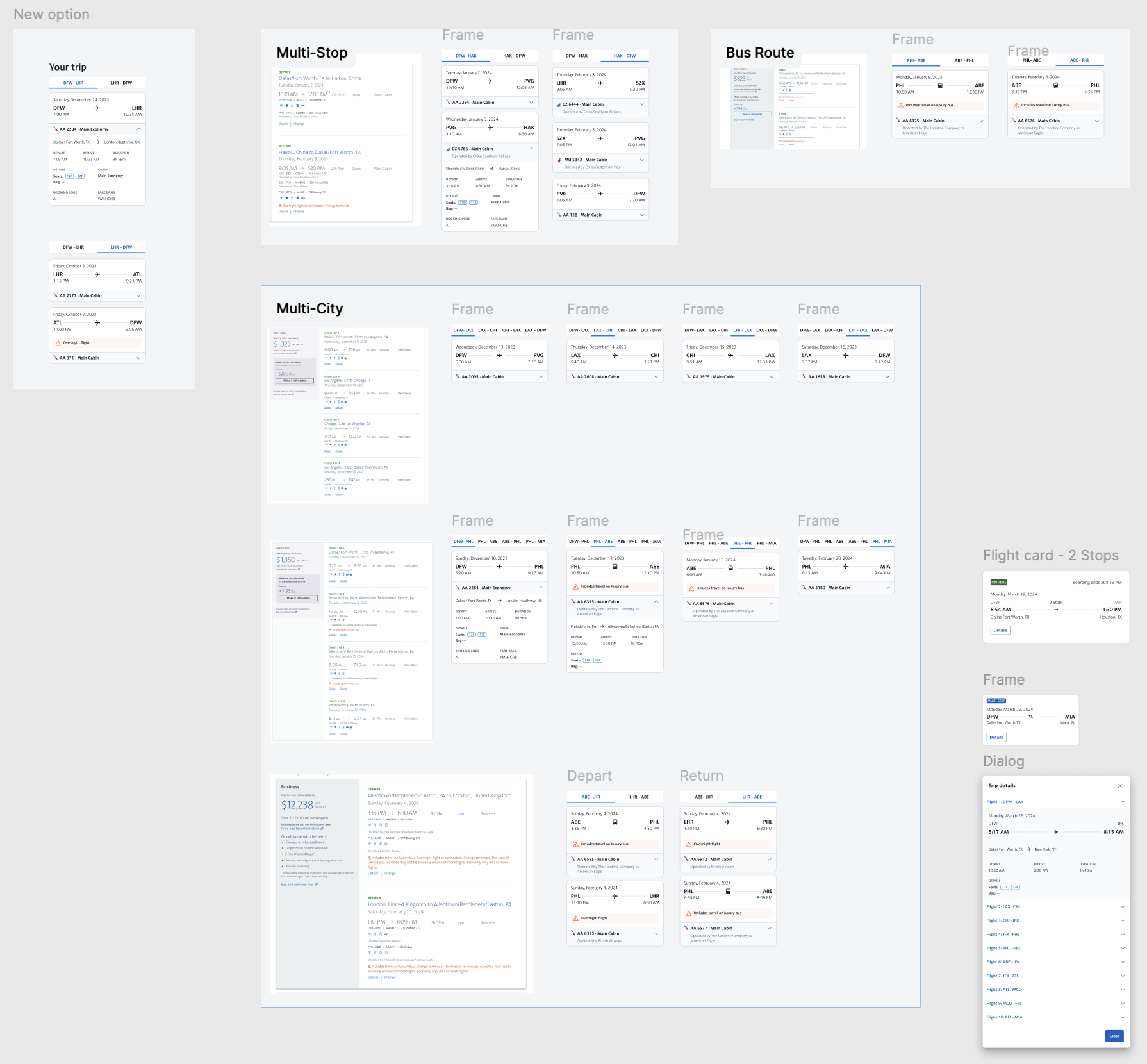
The sessions ended with us having some general goals for the search team to go after and a rough diagram of the vision for what the stakeholders would want the booking flow to be in the future. Our initial design thinking sessions we did as a team helped align all the teams involved on a unified vision for the future of booking on aa.com.

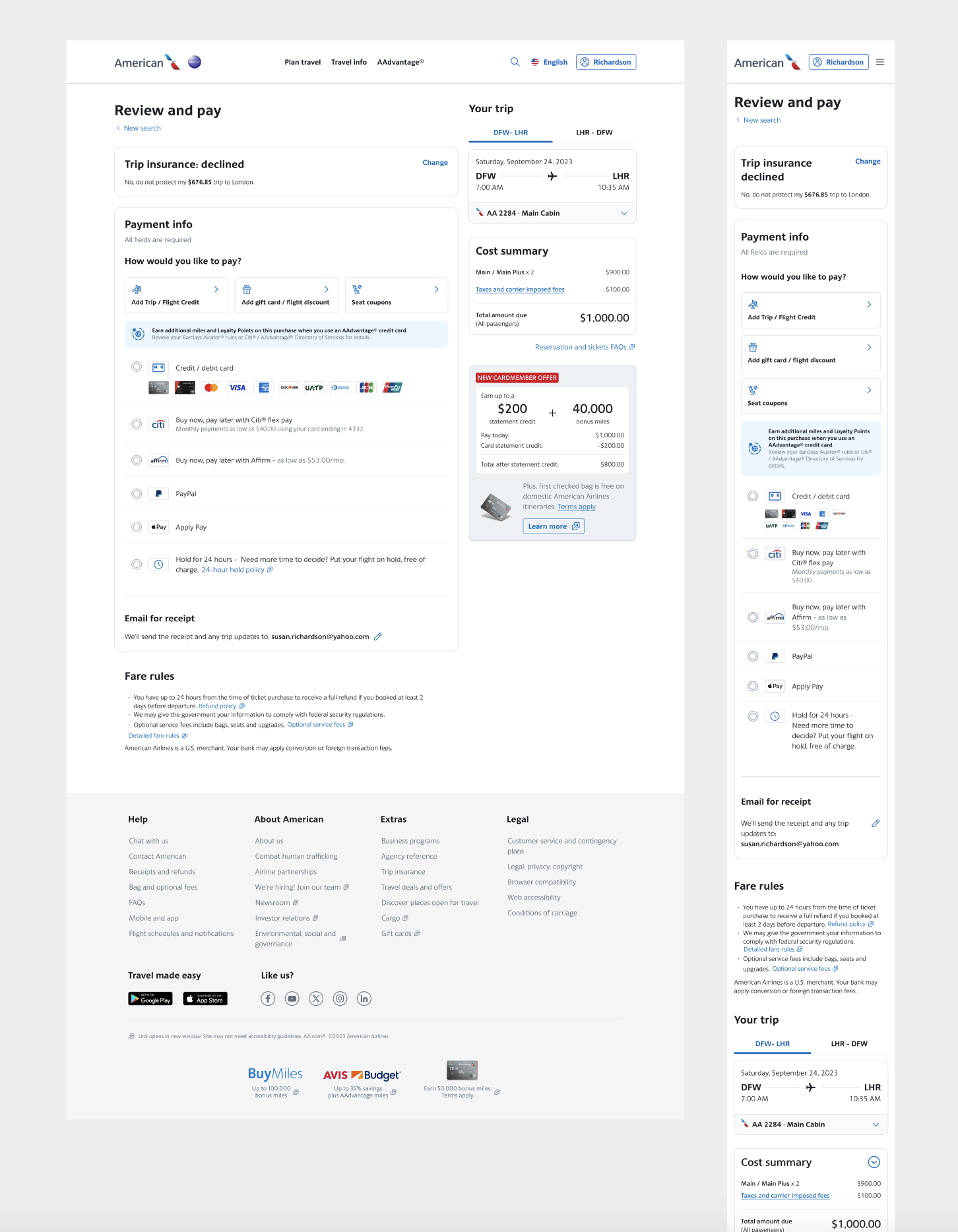
I conducted a competitive analysis of major airlines and leading e-commerce platforms to identify effective checkout patterns and pain points. By comparing user flows, pricing displays, and payment methods, I uncovered best practices that improve clarity and reduce friction. These insights directly informed the design of a new checkout experience that feels modern, intuitive, and aligned with user expectations.
We looked at other major airlines to see what they were doing, but we also looked at large e-commerce sites to see what we can learn from them also.


Cognitive load of the current page is very high
Components on the page don't dynamically reload.
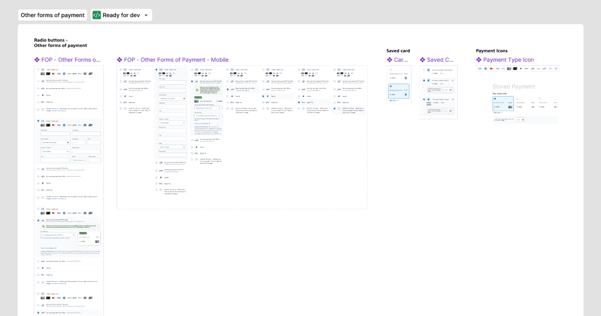
There are hundreds of different products that all have their own checkout page.
Wireframes for the checkout app


In my role, I led the creation of wireframes for a new checkout experience, starting with low-fidelity sketches to align on structure and user flow before moving into interactive prototypes. These wireframes became a shared reference point across teams, helping me collaborate more effectively with product managers to clarify requirements, with developers to confirm feasibility, and with business stakeholders to ensure alignment with goals and constraints. Because the ideas were visual and tangible early on, we were able to surface questions, get feedback, and make decisions quickly. The wireframes also allowed me to run usability tests with users early in the process, validating assumptions and refining the flow before any development work began, which ultimately reduced rework and improved cross-functional alignment.
Picture on testing designs
.png)

One of the enhancements I wanted to make to the American Airlines checkout page was using progressive disclosure on the form. Looking at other e-commerce companies we were able to see how they were building their payment form with steps. Breaking the large payment form into many smaller forms allows us to improve the front-end ux also the back-end architecture.
Some of the benefits:
- Breaking up a very log form into smaller more consumable forms.
- Smaller chunks to do error validation on.
- Dynamically updating components.
- Allowing trip offers to be combined with other payment methods or credits.
We started by breaking the payment form into two steps as the MVP, but then added more steps to include all the different sub-forms that are required for various use cases.
.png)
One of the enhancements I wanted to make to the American Airlines checkout page was using progressive disclosure on the form. Looking at other e-commerce companies we were able to see how they were building their payment form with steps. Breaking the large payment form into many smaller forms allows us to improve the front-end ux also the back-end architecture.
Some of the benefits:
- Breaking up a very log form into smaller more consumable forms.
- Smaller chunks to do error validation on.
- Dynamically updating components.
- Allowing trip offers to be combined with other payment methods or credits.
We started by breaking the payment form into two steps as the MVP, but then added more steps to include all the different sub-forms that are required for various use cases.


Saved card section

Saved card section

Active saved card

Part of the new checkout app was creating a new flight card component. This is a component that appears in many places around aa.com. It took collaboration across many designers to align on the new direction for the card. It took many months of conversation and designing to come to a good solution.
Segment card
The top tabs of the card are the slices and then each card is the segment of the trip.

Expanded view
Includes all the details that users would see on each slice of their flight search.

Code share flights
If a flight is a code share (half AA, half another airline) we wanted to make it more clear that the user will be traveling with another airline for that portion of the trip.

Other transportation
At American Airlines we also offer tickets with buses and train legs. So we would need to make it clear to people that they are purchasing a ticket that could be a bus and a flight.

- All additional journeys
- Modal
- QR code on the kiosk
....
....
Thanks for reading!