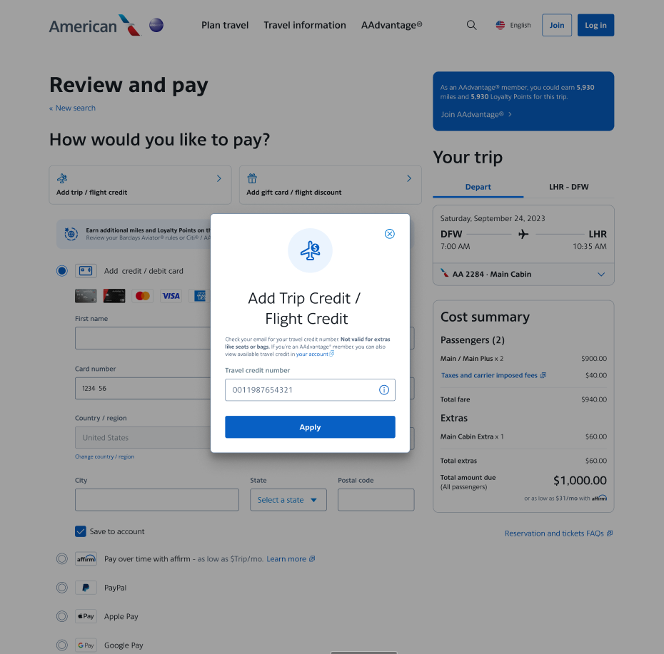
Problems we uncovered
The travel credit modal has a high error rate and my team wanted to reduce the errors that users were experiencing.
We looked in our anayitcs program and tracked the most common errors that users were experiencing:
- The error feedback could be clearer
- You enter both trip & flight credits into the input
- Most people don't know where to find their travel credit number
- Logging in isn't clear
- A lot of space is taken up by decorative elements.
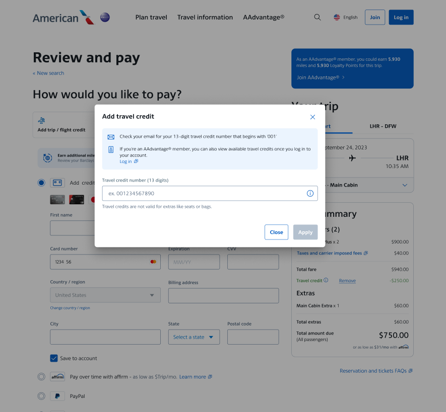
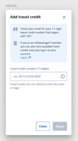
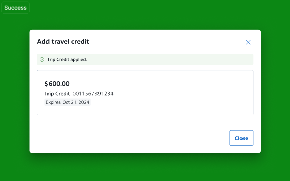
How we fixed it
- I changed the modal header to just add travel credit. From our testing, most people know know the difference between a flight or trip credit.
- I created a highlighted section at the top to direct people where they could find their credit number to enter or to log in to see available saved credits.
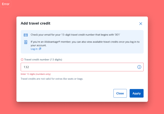
- We added new more direct error messaging.
- Added placeholder text before a user starts typing.
- We disabled the apply button until the user starts typing.
Final Outcome
We were able to reduce error rates on the modal by 8% and calls into the support center on how to use trip credits.